Ray Of Light Therapy
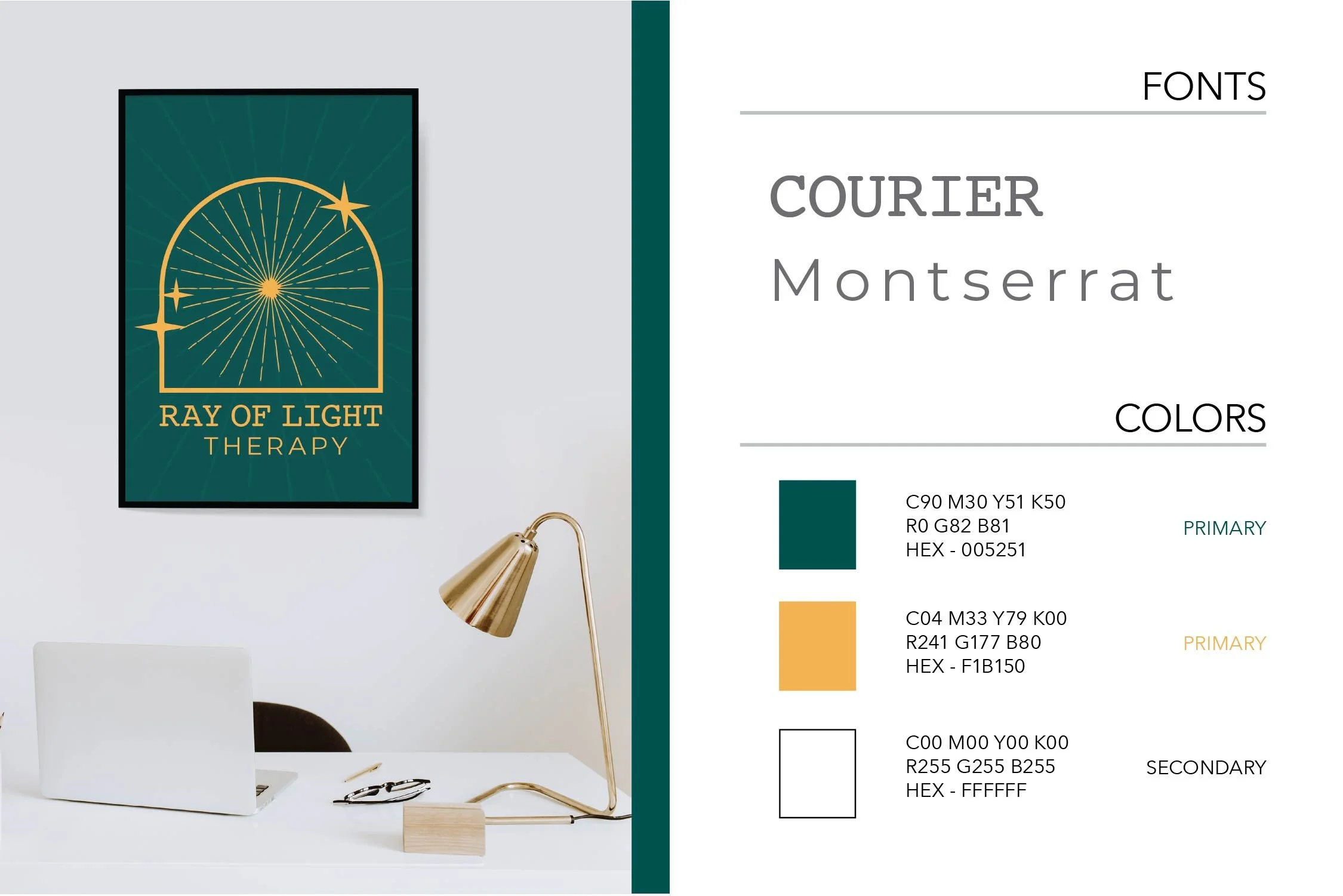
Asking for help especially with your mental state we understand can be scary. Thinking of sterile white walls and clinical terminology you don’t understand can keep people from getting the assistance they need in their every day life journey of healing. With Ray of Light Therapy it was important to set them apart to give a welcoming warm feeling for someone who is looking for their light to progress. Jewel tone colors giving you an protected and cozy feeling, imagery that feels not clinical and really gives you a sense of the name, Fonts that are clear to read with parts feeling rounded and also open, are the details that were thought about to create the voice of this brand.
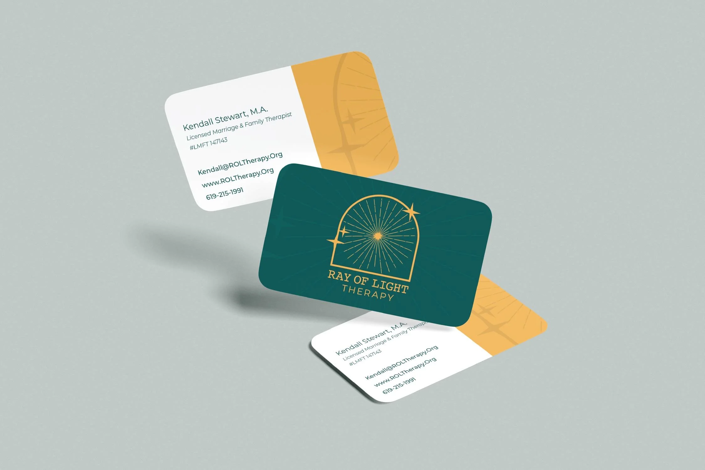
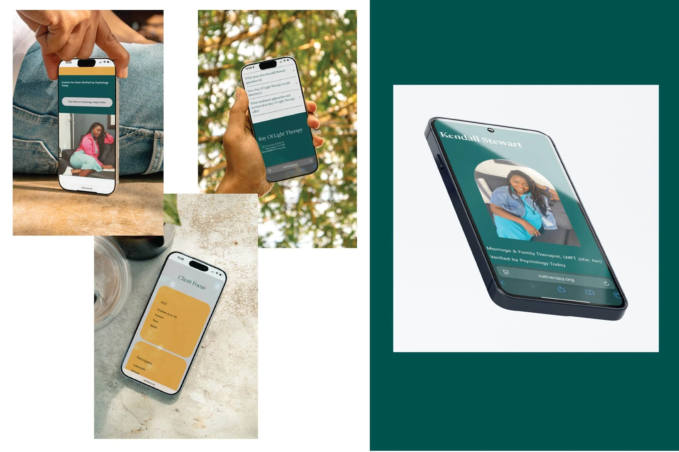
Details we specifically wanted to think about included, soft velvet touch feel business cards so that way any client who is handed one gets a sense of calm when they touch it and shows intention for the clients, imagery in the website showing the therapist so you know who you will be interacting with (giving a face to a name so there is no surprises on who you will be talking to), Ray of Light Therapy see clients of all kinds but also wanted to emphasize their focus on making sure therapy is accessible to the black community of women and children who often get ignored so we made sure the imagery reflected that since normally it is not seen on others websites often making it something to feel taboo if you never see people like you getting therapy, and consistency always using both of the colors through out the branding to make sure it becomes recognizable ( from wall art, to website, to flyers).


